


Explore by Category:
Product
How Storefront UI solves website accessibility issues with custom directives

Let’s cut to the chase… 2020 will be the year of accessible web pages. It is already required by law for federal and government websites to follow WCAG guidelines, and it is only a matter of time when accessibility becomes the next must-have, particularly in eCommerce sites where access to all people at all times is a major driver of sales.
So what exactly is web accessibility?
Accessibility (or ‘a11y’ for short) is a coding practice for creating websites which are more usable for everyone. It involves two main issues: how people with disabilities access electronic information (as they use devices like screen readers) and how to make websites more friendly on mobile devices and with a slow internet connection. We already care about responsiveness when developing commercial apps but we should also have a11y in mind from the very beginning. It makes for better user experiences and also for better business outcomes.
Common accessibility issues
A11Y is a broad concept that requires covering a lot of edge cases when developing a website. Let’s go through some of the most common accessibility issues to give you the bigger picture on some of the complexities.
1. Low contrasts
If the text has a low contrast then it can become indiscernible for people with low vision or color blindness. The WCAG 2.1 guidelines require a contrast of at least 4.2.1 on typical text. This is a case for both designers and developers to bear in mind when building sites.
2. Invalid semantic
Keeping good HTML semantics is a golden standard in web accessibility. Typical users rarely read the entire page; they usually just scroll for the headings or bolded text. Screen readers, which are an Assistive Technology that render text and images as speech or Braille output, work similarly. They get the information about Document Object Model (DOM), so having a semantically correct page makes browsing easier for users.
3. Missing alt texts and aria-labels
Aria-labels and alt texts allows for the description of elements like images and icons which are then read out loud to blind users. Missing those properties makes these web page assets invisible to such users.
4. Navigation
Focus states are the key in making all the interactive elements on the page accessible. Without buttons and links being clickable, it basically makes the webpage unusable. This is an issue I’ll cover in some depth in this article.
As you can see, there are a few essential rules that we should follow to make our website more accessible. You can see a full list at Web Content Accessibility Guidelines (WCAG) but my personal favorite is:
NEVER REMOVE FOCUS OUTLINE
Not everyone can use a mouse; many people with physical, visual or cognitive disabilities use specialist keyboards instead. Using the CSS rule :focus { outline: none; } to remove an outline (this ugly blue focus ring we all hate) causes the element to be focusable but removes any visible indication of focus for keyboard users. It results in keyboard-only users being unable to interact with the link or control. Yes, the browser’s default focus rings are ugly and it is tempting to remove it with one single rule, but don’t do that.
Still not convinced? Imagine that your mouse or touchpad stopped working and you needed to urgently login to your bank account. Navigating through the page without visible focus states would be a real-life nightmare and would probably make you throw your computer out of the window.
So, how do you have your cake and eat it?
Custom Vue Directives to the rescue!
In Storefront UI, we came to the point where taking care of a11y was more and more demanded by the community. We wanted to hide the ugly focus rings on mouse clicks but keep them for the keyboard events at the same time. To achieve it, I came up with the idea of a custom v-focus directive. Vue.js custom directives are potent tools that provide a mechanism for mapping data changes to arbitrary DOM behavior.
We wanted ours to be easy-to-use and reusable, so we created a separate file with the custom directive code.
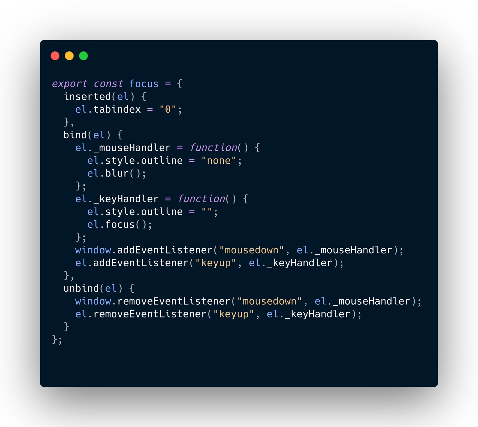
For our directive, we used just three basic hooks. Pretty simple, right?
bind: called only once, when the directive is first bound to the element. Here is where all the magic happens. In our case, it adds event listeners for mousedown and keyup events. When triggered, the focus outline is set on a keyup (tab) event and removed on a mouseclick.
inserted: called when the bound element has been inserted into its parent node. We use it to set the '''tableindex''' property to '''0''' to make sure the element is always focusable.
unbind: called only once, when the directive is unbound from the element. At this very moment, we remove the event listeners.
Everything looks good here. Now it’s time to use our custom directive. I’m going to import it to SfColor but you can use it anywhere in the application.
Once registered it is ready for use with the v- prefix. Once applied, it will add focus ring only for keyboard events.
In Storefront UI, we currently use the default outline styling but we do plan to implement a custom focus as there is no problem to add styling to the directive. The output should look like this:
As you can see, the core code and usage of the directive is pretty simple. It does require more time than simply removing the outline in the CSS rule; however, we end up with a reusable, functional component. In my opinion, it is really worth it!
You can plan with the component and see the custom directive in action here .
Creating websites without having accessibility in mind can cause a huge loss in potential users. You need to think about the needs of different people when creating any site and what is currently a trend will soon become the standard. All interactive elements should have a visible focus state and using ```outline: none```is simply a bad practice. In StorefrontUI, we took care of that with a directive that is easy to use and (like everything in our project) extremely customizable.
Share:
Share:

More in Product


Ready to dive in? Schedule a demo
Get a live, personalised demo with one of our awesome product specialists.