


Explore by Category:
Product
Creating themes in Alokai (part 1 — understanding Alokai core)

IMPORTANT NOTE: This article is written for Alokai 1.0. Some parts may be different in current VS version. If you have any problems with setting up your theme please take a look at our readme or join our slack where you can ask me and almost 500 developers for help.
Technical Whitepaper
In Alokai you can easily implement your own theme which benefits from all Alokai core
features. One of the coolest things is that you’re not limited by any architectural requirements yet still can use all Alokai features in frontend and all backend features of CMS you decided to use.
You can think of your theme as a separate Vue.js application. You have the flexibility to choose component architecture, CSS preprocessors, HTML templating engine etc. by yourself. You can also use one of the thousands available Vue.js plugins, components, and extensions (I highly recommend checking out awesome-vue to browse the most popular plugins for Vue)
In this article, I will explain the ideas behind Alokai and it’s theme system.
Prequisities
In this tutorial, I’m assuming that you have zero or very small experience in developing Alokai themes.
Keeping this in mind I first recommend reading some of our docs to get familiar with Alokai architecture and theming system:
- Alokai project structure
- Working with Alokai core components
- Working with themes
This articles should give you a basic understanding of how Alokai themes works — to be honest it’s all about injecting core components as a mixins to your theme’s components so they can inherit the business logic from core.
We implemented all basic eCommerce business logic for functionalities like products, categories, variants, checkout, microcart, customer profiles in a core so you don’t need to write them by yourself. You can override them, extend or write your own business logic — it’s all up to you and depends on your needs. In the current milestone (Feb 2018 v0.5) we are focusing on making the core components API as easy to work with as it’s possible.
Before creating a new theme you should take a look at currently existing themes. They are all crafted by experienced UX designers, easily customizable and open source.
Okay, let’s make our hands dirty and see what we have in Alokai ;)
Setting up Alokai
Before diving into theme system we need to install Alokai. The process is very easy thanks to our installer. You can setup the VS and it’s NoSQL database containing example products locally and later connect it to your Magento/Pimcore instance.
The process of installation is described in our README and is pretty straigtforward even for less experienced developers.
Once we have VS up and running we can play with it a little bit and see how to achieve some theme-related goals.
Creating new VS theme
Let’s take a look at it and learn how we can make a new theme:
There are two ways of creating your own VS theme
- Copying and modifying the default theme which is fully-styled and ready to work out of the box (it’s the one that you can find on our demo)
- Copying and modifying theme-starter which contains only data and no styling. It requires more work to have it production-ready (you need to style it from scratch) but if your designs are much different than our default theme you’d probably want to start with this one.
To create your own theme just copy the theme-starter or default folder located in src/themes and change it's name to your new theme's name. Next change the name property in your theme's package.json file. You can use this name in your config file to change the active theme. Now you can start development of your own theme for Alokai!
As you can see the process of creating new theme is quick and easy. We are copying one of currently existing themes and changing it’s name — that’s all!. We’ll use this knowledge in the next part of the series where we will create our own VS theme.
Please note that at the moment of writing this article theme-starter is still under development and there are some features that are not yet available out of the box there. Adding core functionalities to theme by yourself is very easy but still takes more time than using default theme with everything out of the box. Finishing theme-starter is one of our most important issues now.
Changing active theme
To change currently active VS theme we need to take a look at our docs again:
To use any of the themes located in src/themes just change the theme property in your config file to name property from package.json file sitting in your theme's root dir. The config files are located in config folder. You shouldn't make changes in config/default.json. Instead just copy the default.json file to the same folder, name it local.json and make changes there.a
As you can see we only need to change the active theme’s name in our config file and voila!
Using Alokai core in your theme
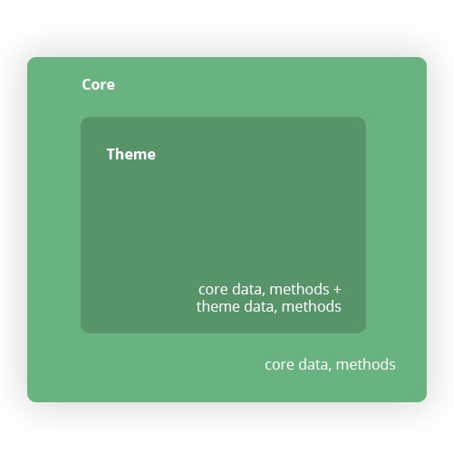
Before making use of Alokai core it’s essential to understand how it works.
To better understand the concepts let me start with an abstract example of category page to visualise how the core is intended to interact with themes.
Let’s say we have a category page (lets call it “core category page”) as a Vue component with following structure:
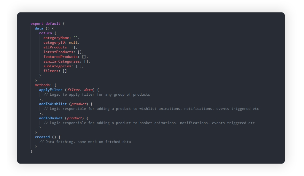
As you can see we have some functionalities allowing us to play with the categories (we don’t care how they are implemented). It’s only business logic but covers most of the actions we need to perform in order to work with the categories from fetching data to applying filters and adding items to basket.
Alokai core is full of components like above grouping business logic for specific pages or components (Home, Category, Product, Checkout, Wishlist, Basket, Product listing, Filters etc). Now when we want to use this component methods in our theme we don’t need to write this business logic from scratch. We can inject any core component as a Vue mixin and make use of their methods and exposed data.
Let’s see how we can do it:
import { corePage } from 'lib/themes'export default {
mixins: [corePage('Category')]
}IMPORTANT: This API slightly changed. corePage and coreComponent methods has been removed, you can find the new API.
And that’s all you need to make use of the core component! The deeper an explaination of this process can be found in our docs.
After injecting this core Category page into our theme we can make use of its methods, override and extend them. Let’s see some basic example of using this core component in our theme component:
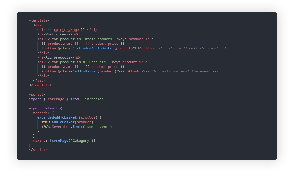
As you can see we are free to use all methods and data from our core category page and even extend it (like in the extendedAddToBasket method).
One of the key concepts behind Alokai is that these methods and data in the core will not dramatically change during the updates so you can benefit from all new features introduced during the updates without breaking your shop or rewriting half of it. The body of the methods may change but the returned values or actions they are performing will remain the same.
Bottom line
I hope this tutorial gave you a deeper understanding of how Alokai core works and how to properly use it in themes.
In the next tutorial, we will make our hands a little bit dirtier and use Alokai core components to create a new theme.
Share:
Share:

More in Product


Ready to dive in? Schedule a demo
Get a live, personalised demo with one of our awesome product specialists.