


Explore by Category:
Product
Getting Started with Storefront UI 2 and Nuxt.js
.png?auto=webp&width=40&format=pjpg&disable=upscale&quality=100&dpr=2)
Check out our video version below if you prefer.
In this article, you will learn how to get started with Storefront UI 2 and Nuxt.js - we will go through the installation, usage, and the first steps in the customization. Start up your IDE and let’s begin!
If you prefer Next.js instead of Nuxt.js, you can head to our article about Getting Started with Storefront UI 2 and Next.js
Project preparation
For this guide, we will use Nuxt.js, let’s first start by creating a new Nuxt.js application. In the directory of your choice, run the following command:
npx nuxi@latest init sfui-app
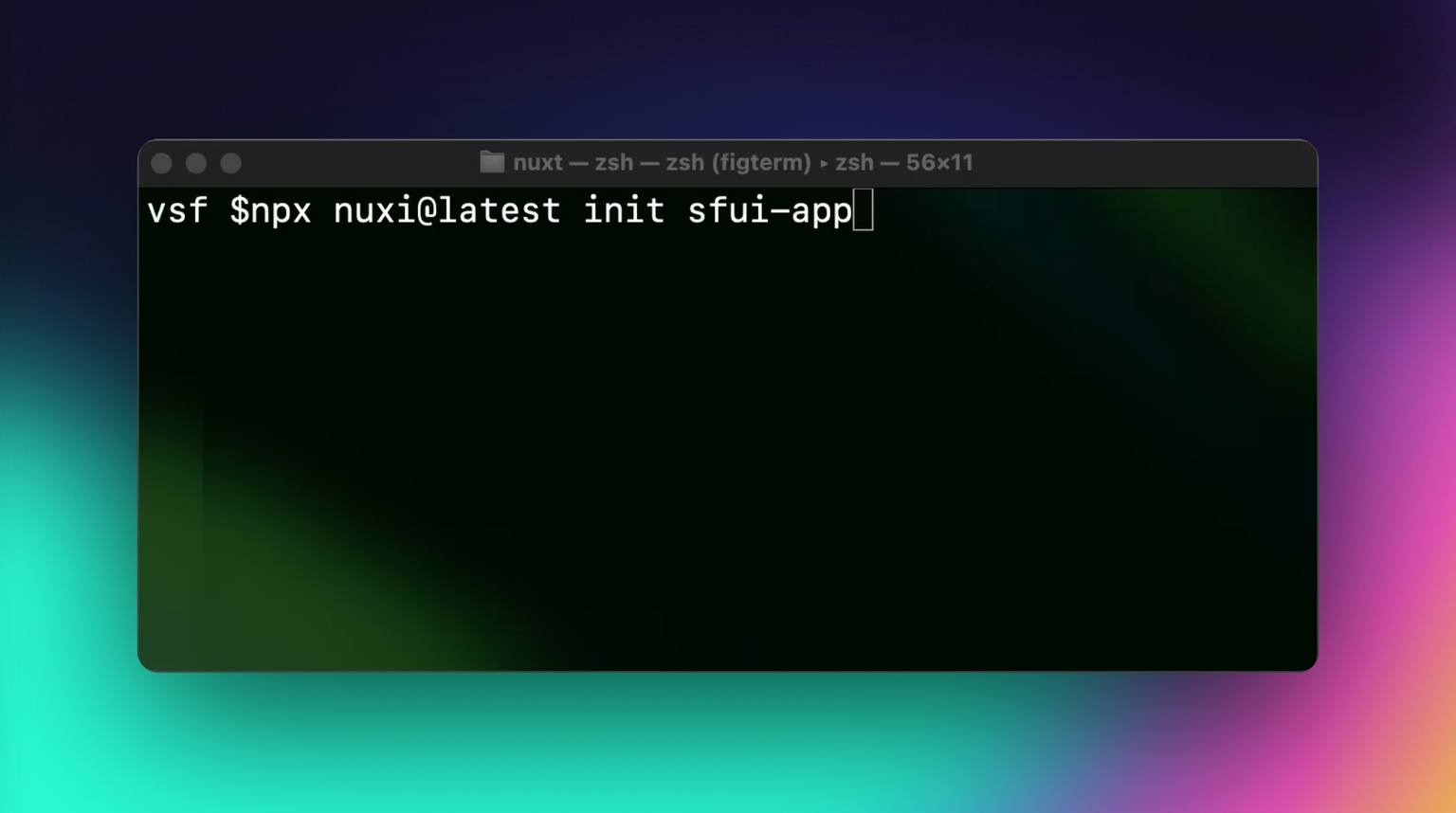
sfui-app is a name for a new application, you can keep it as is or select any other name.
Once the new Nuxt application is created, open it up in the IDE and run yarn to install all dependencies. Great, we have set up the project and can proceed with the Storefront UI 2 installation.
Storefront UI 2 installation
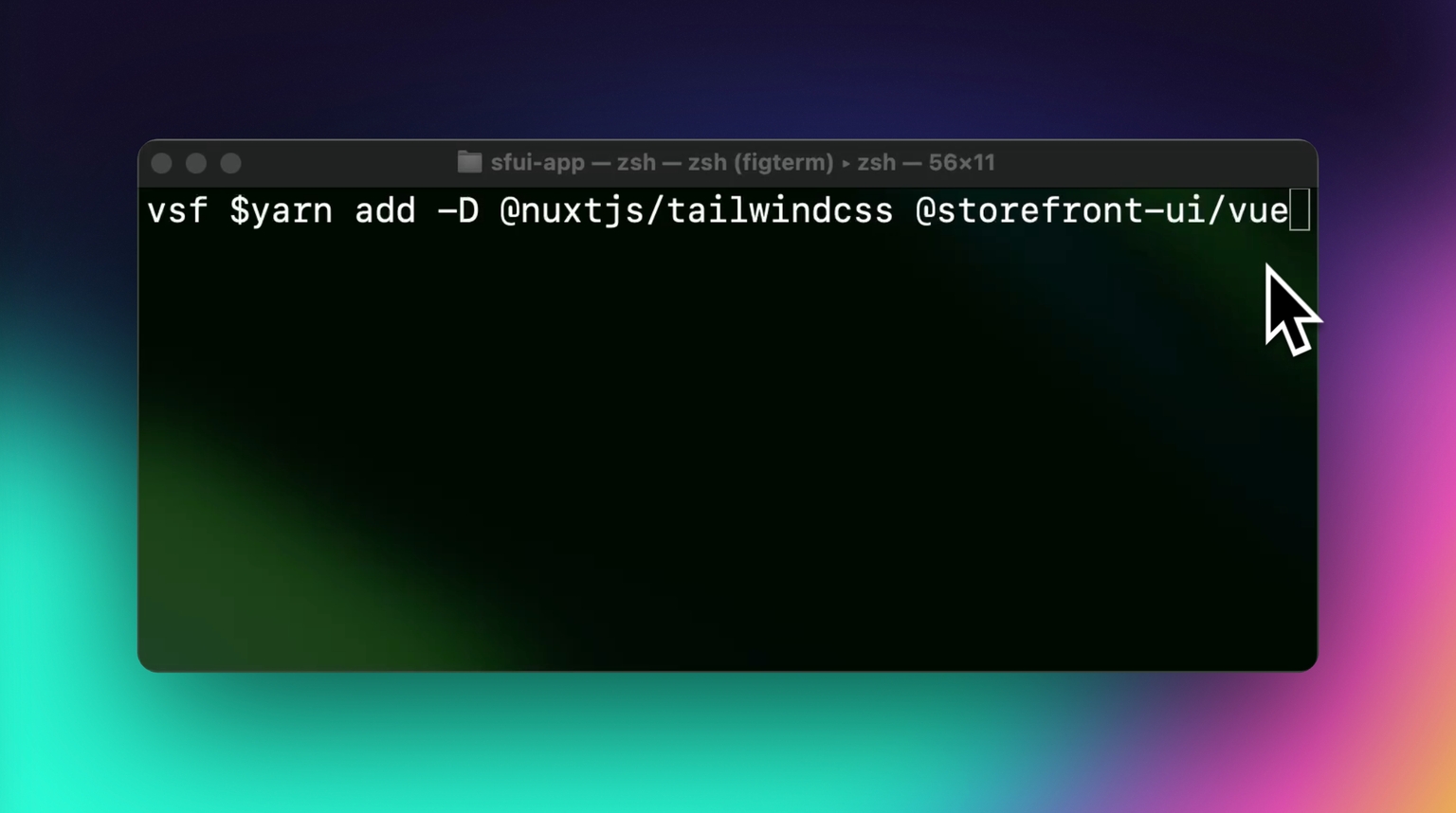
Go to the docs - Storefront UI 2 and select Install for Vue, on the installation page you will see the instructions to install Storefront UI 2 for the Nuxt.js application. For this guide, we will use the Yarn package manager.
Inside the new project directory, run the installation command:
yarn add -D @nuxtjs/tailwindcss @storefront-ui/vue
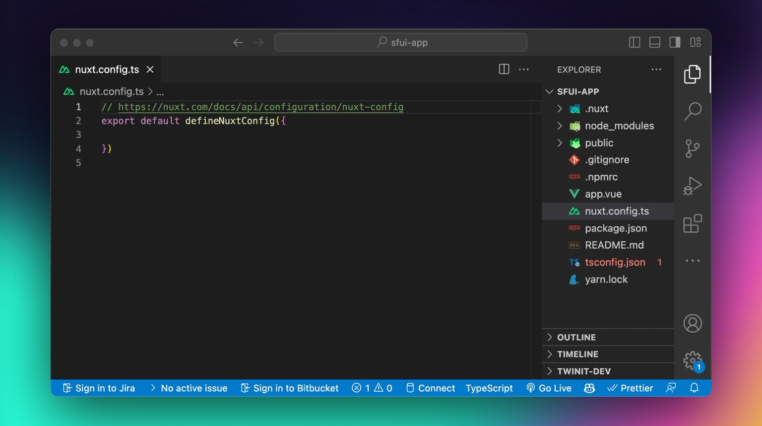
After Storefront UI dependencies are installed, open the nuxt.config.ts file and add tailwind configuration, as per docs:
export default defineNuxtConfig({
 modules: ['@nuxtjs/tailwindcss']
})
Now we need to configure Tailwind CSS with Storefront UI styles. For that, open tailwind.config.js, or if this file does not exist, create it in the app’s root folder:
touch tailwind.config.jsInside the tailwind.config.js file, paste the following configuration:
import type { Config } from 'tailwindcss';
import { tailwindConfig } from '@storefront-ui/vue/tailwind-config';

export default {
 presets: [tailwindConfig],
 content: ['./**/*.vue', './node_modules/@storefront-ui/vue/**/*.{js,mjs}'],
};
Great! This is all that we need to do to start with Storefront UI 2! Let’s import our first component and see if that works. In the app.vue file add the code below:
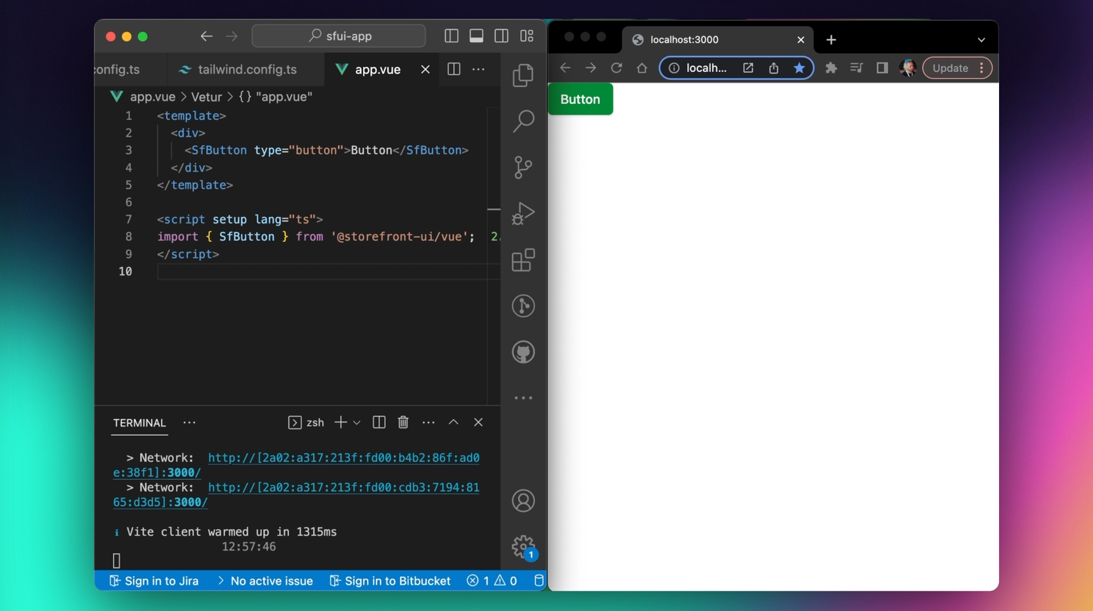
And, it works as expected! Now, you can start building with Storefront UI 2, but before that, let’s learn more about Storefront UI 2.
Storefront UI 2 overview
Storefront UI 2 was created as a library that will suit all your needs to build beautiful, mobile-first, accessible, and performant UIs and design systems.
Storefront UI consists of the following:
- Base components - simple components to build on top
- Blocks - complex and large components, built on top of base components
- Typography - package to simplify usage and customization of third-party fonts
- Themes - a configuration file to keep your styling consistent across the app
- Composables - functions to help you build an interactive experience for the users
For the Getting Started guide, let’s check how to use Base Components and Blocks.
Base components
Base components are the very basic components of every UI. They include buttons, links, counters, and many more.
You can find a full list of components on the Base Components Overview page .
We have already used the SfButton component in the last chapter, now let’s learn more about it. SfButton is a simple input element, that can be used to submit forms, navigate through the pages or react to the user’s onclick events. SfButton, like any other component, can be customized using props and slots, or by providing/overriding Tailwind CSS classes.
You can use SfButton either by importing it from the library and further customizing it to your liking or, if you want full control over it, you can copy its source code.
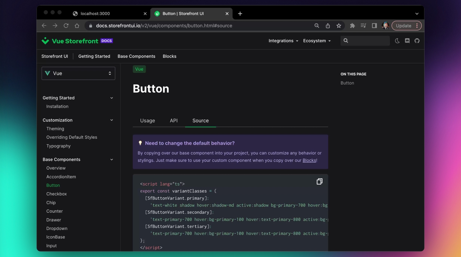
You can find the component’s source code on the Source tab on the documentation page.
Storefront UI 2 gives complete freedom to developers to customize components in any way they prefer. Let’s import a few SfButton components from the example in the docs to our application and then, create a customized SfButton using its source code.
In our code, let’s duplicate the SfButton component in the template and change variants to "primary", "secondary", and "tertiary", also, we will add some styling to the parent div to make it look consistent:
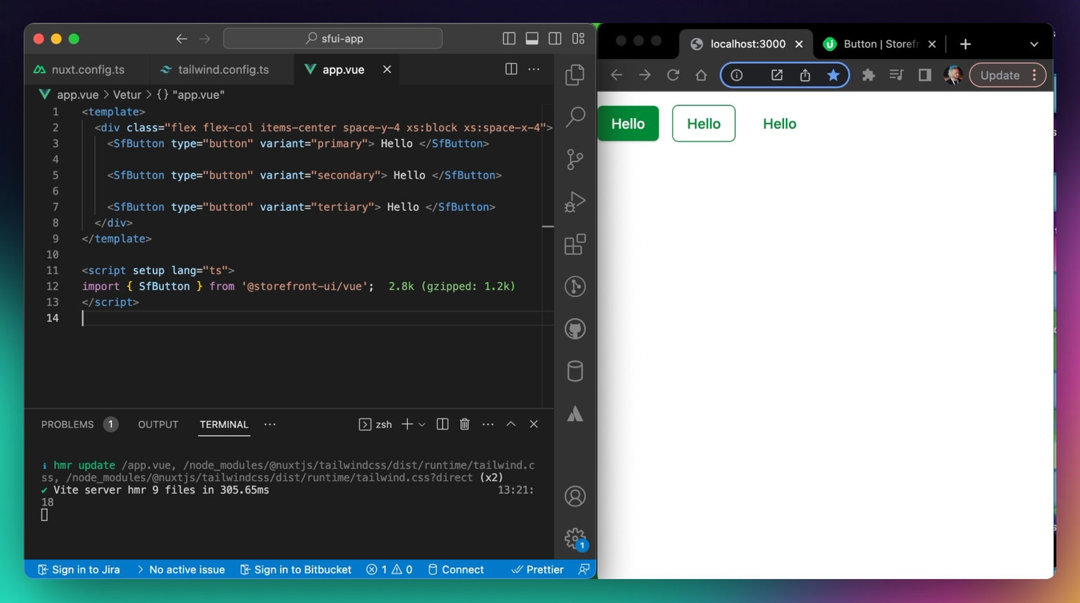
As you can see, you can change the styling by simply providing different props.
You can find all available props in the documentation (Button) .
Now, as was mentioned previously, if you are not satisfied with either default SfButton styling or functionality and want a complete custom solution, you can copy its source code. Let’s do that!
Go to the SfButton documentation page and click on the Source tab. Copy the component’s source code, create a new file in the project directory, and paste the contents there:
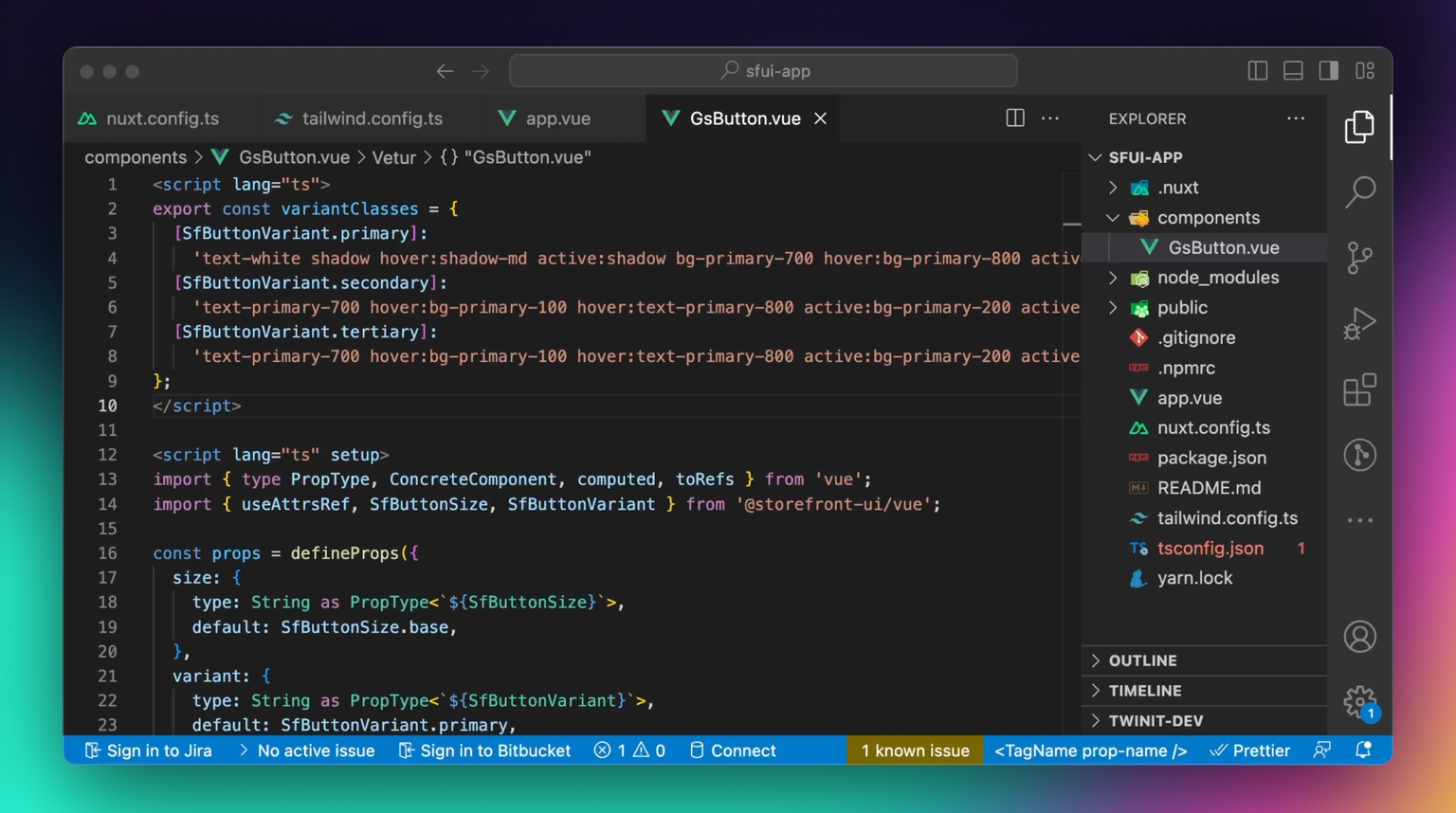
We called the file, GsButton - but you’re free to name it the way you like.
Let’s change something in this button, to make it custom. We will change the primary variant style to make it red by default.
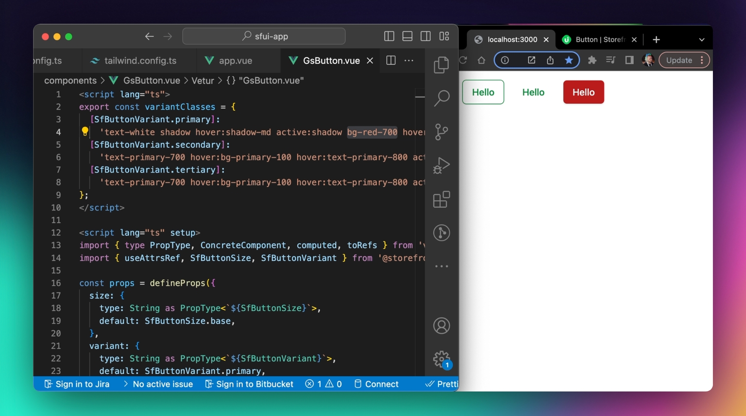
As you can see, now our new custom GsButton is using the bg-red-700 Tailwind class by default. You are free to change anything you want, whether it’s styling or the functionality of the component.
Blocks
Blocks are large and complex components, usually with their own state built on top of the Base Components. Storefront UI 2 provides many blocks already and more are coming soon!
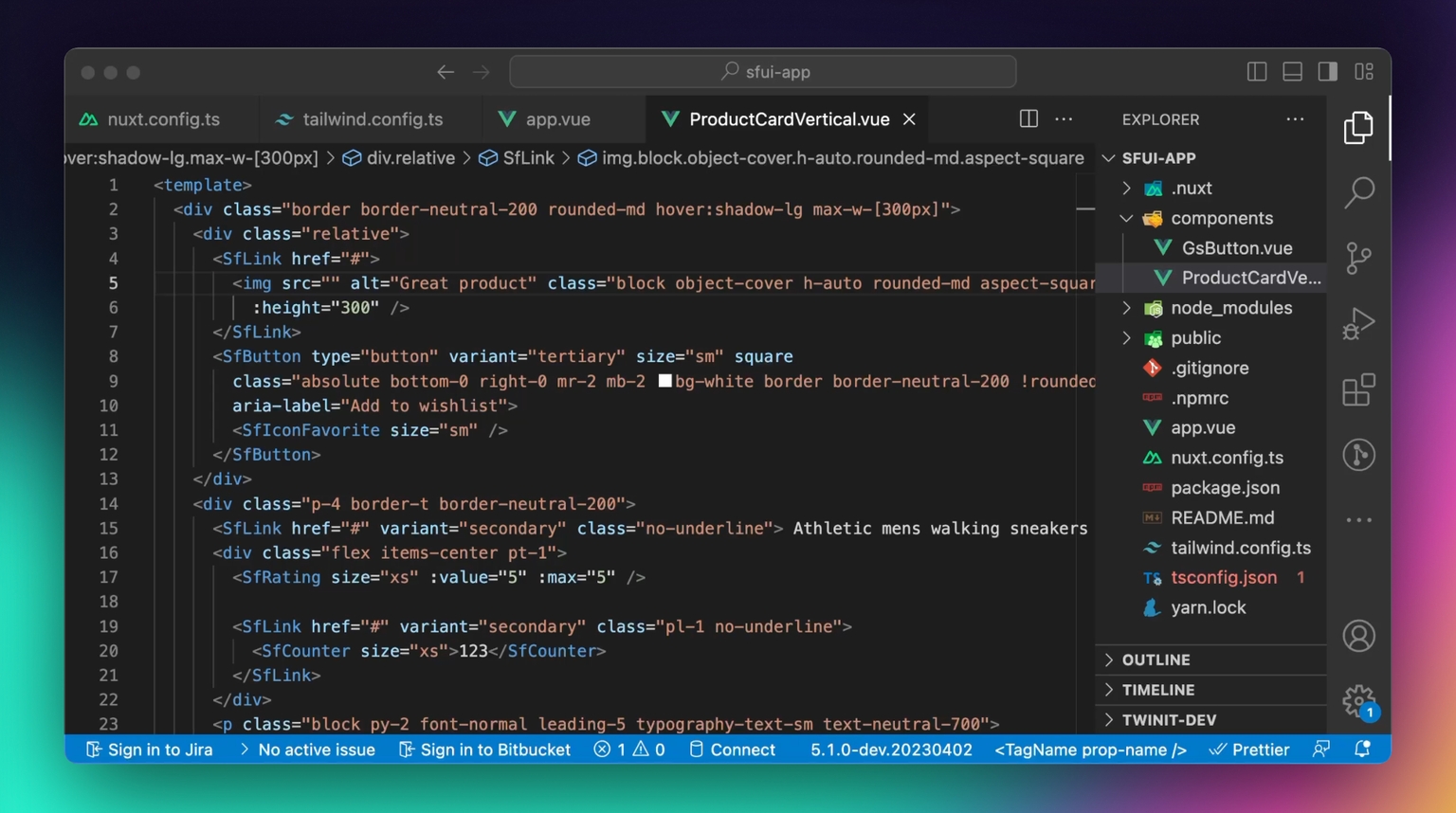
To use Blocks, you need to copy its source code into your application and customize it further or use it as is from the docs. For this tutorial, we will use the ProductCardVertical block. Go to the respective documentation page and click on the Code tab. Copy the block’s source code and create a new file in your application:
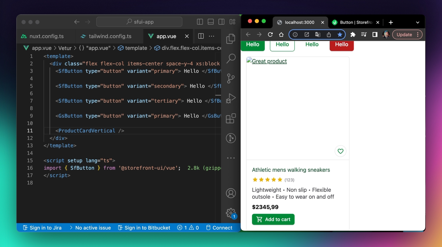
Now, let’s add it to our app.vue file:
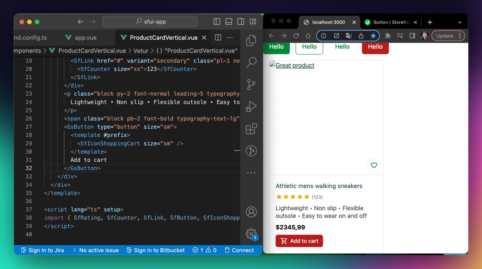
Since, most probably, you would want to use the custom GsButton that we have created previously in your ProductCardVertical component, let’s replace SfButton in the block’s source code with GsButton.
Great! We started building our design system!
You can read more about different Blocks in the Storefront UI documentation .
Start building with Storefront UI 2
Congratulations! You have successfully installed and configured Storefront UI 2 🎉
In the next tutorials, we will go through customization and theming in more detail, but even now, you are able to start building sophisticated eCommerce UIs with Storefront UI 2.
If you liked this tutorial, please share it with your friends and colleague and help us improve Storefront UI 2 even more! Also, if you like the project, give us a star on GitHub .
Storefront UI is an Open Source and Free project, your contribution is welcomed!
Have any questions? Reach out to us on Discord - we are always happy to help you and answer your questions!
Share:
Share:


Ready to dive in? Schedule a demo
Get a live, personalised demo with one of our awesome product specialists.